- Login to the application using the credentials provided by Technical Toolboxes
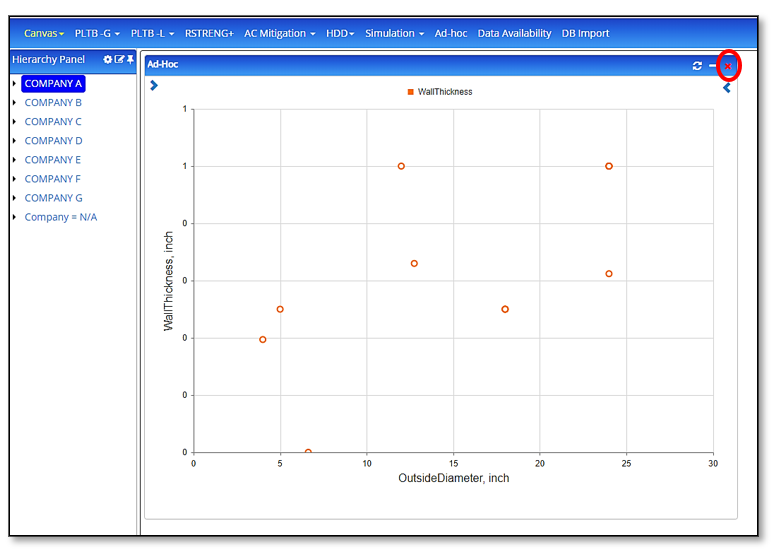
- Click on “Ad-hoc” from the application menu bar, which loads the Ad-hoc widget on the canvas
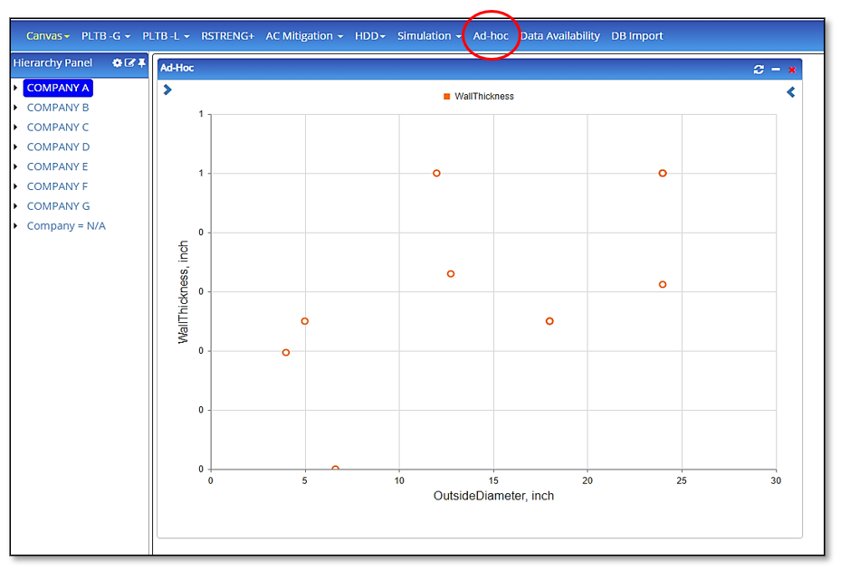
Note: Ad-hoc is available only when the user has subscribed for the hierarchy panel
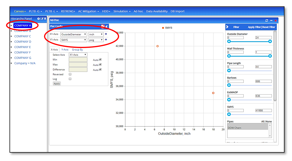
- The hierarchy/map controls as to what options in the X and Y axis are available for plotting. If user selects an asset on the hierarchy, all the input and output data related to the asset is loaded in the X and Y axis dropdown list
- If a pipe is selected on the map, all the input and output data related to this pipe across all modules loads up in the A and Y-axis dropdown list
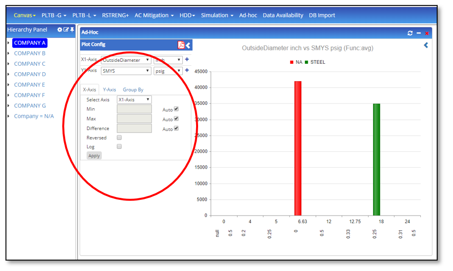
- The left side accordion/arrow opens axes selection, configuration, and grouping options
- The left side accordion/arrow opens axes selection, configuration, and grouping options
- The user can select the x and y-axis along with the units for the selected options
- The user can add a maximum of 2 X-axes and a maximum of 4 Y-axes along with the units
- All X-axes can be configured in the X-axis tab with minimum scale, maximum scale, autoscale, scale interval (difference), invert scale (reversed), and setting the X-axis as a logarithmic scale
- All X-axes can be configured in the X-axis tab with minimum scale, maximum scale, autoscale, scale interval (difference), invert scale (reversed), and setting the X-axis as a logarithmic scale
- All the above changes can be committed by clicking on “Apply”
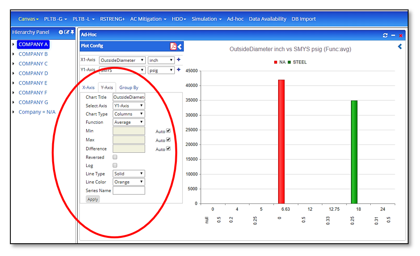
- Similarly, all the Y-axes can be configured in the Y-axis tab with all of the above options. Additionally, users can configure what the chart type is for each of the X vs Y plots, line type, line color, series name, and a chart title.
- Similarly, all the Y-axes can be configured in the Y-axis tab with all of the above options. Additionally, users can configure what the chart type is for each of the X vs Y plots, line type, line color, series name, and a chart title.
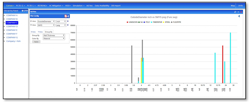
- Group by tab gives the user the flexibility to group/stack the plot with the option selected. The plot rolls up data based on this selection
- Color by allows the users to color their rolled up/stacked/grouped plots to be colored based on a particular selection from this option.
- Color by allows the users to color their rolled up/stacked/grouped plots to be colored based on a particular selection from this option.
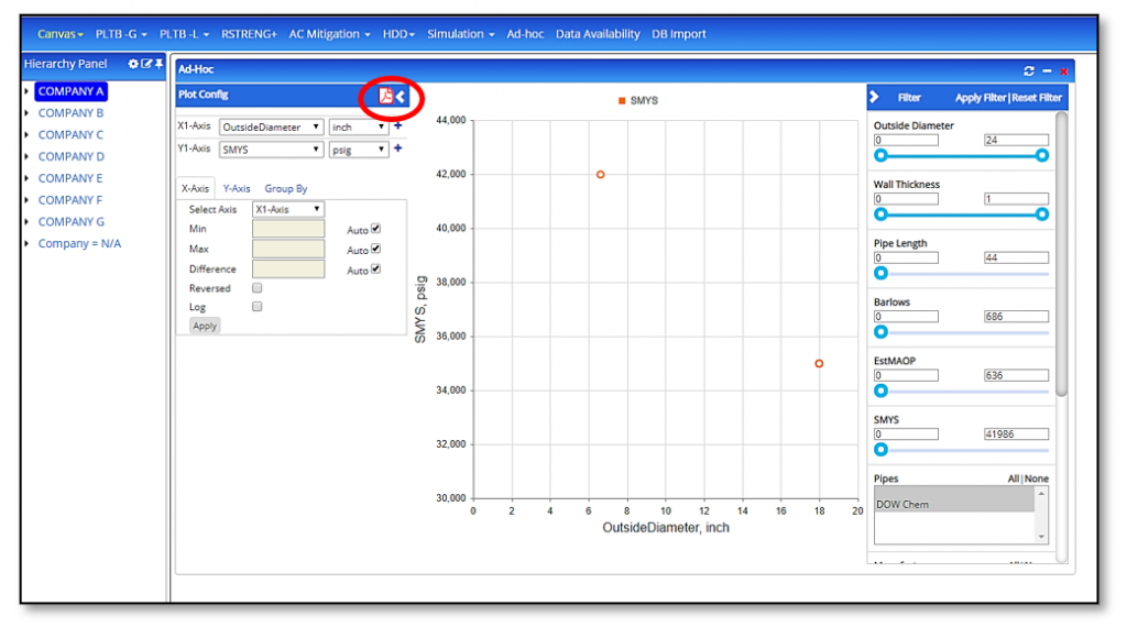
- The PDF icon allows the user to export and save the plot in PDF format
- Excel icon allows the user to export and save the plot data in excel format
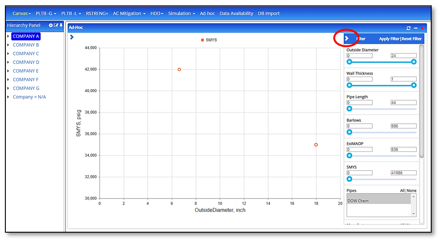
- The right side accordion/arrow opens up filtering options for the user. This is a button that can be turned on/off in the plot which are displayed
- All options in filtering are selected/turned on by default
- All options in filtering are selected/turned on by default
- Creating new plot series using multiply/divide/etc from 2 existing parameters
- Count function plots the total number of points for the selected attribute
- Sum function plots the summation of the selected attribute
- Average function plots the average value for the selected attribute
- Minimum function plots the lowest value for the selected attribute
- Maximum function plots the highest value for the selected attribute
- Cumulative distribution function is a plot series for the cumulative distribution function
- Min is the value the user chooses for the scale to begin with
- Max is the value the user chooses for the scale to end with
- The user may choose the scale to be auto-scale
- The user may choose to set the numbering interval of the scale by entering the difference
- Reversed is when the user wishes to reverse the plot scale
- Log is used when the user wishes to use a logarithmic plot or a log-log plot
- Click on the refresh button to update plots with the most updated data from the database
Note: This may take some time depending upon the data content