
Widget
Introduction – What is a Widget
A widget is a user interface that contains calculations, visuals, or guided worked flows that can be added/removed from the canvas. Every software application within the HUBPL is configured with a widget or set of widgets.
Widget Anatomy and Functionality
Widgets in the HUBPL have basic functionalities that are consistent/common across all widgets. However, some functionalities of a widget are specific to a particular use-case and are therefore unique.
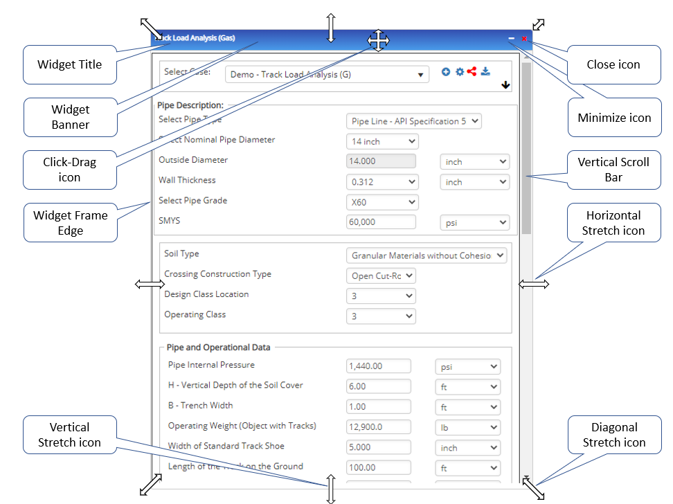
Widget Frame
The boundary “box” defines what’s in/out of a widget.
- The widget frame can be resized. The spacing of contents dynamically responds to changes in the width of the widget, and vertical scroll bars appear as needed when changes are made to the height of a widget.
- Click and drag on any edge of the boundary to change the size in one plane only.
- A horizontal or vertical stretch icon will automatically appear on the screen when the cursor is near an edge
- Click and drag on any corner to change the size in two planes at once
- A diagonal stretch icon will automatically appear on the screen when the cursor is near a corner
- Click the minimize icon (“-” at top right) to collapse the widget vertically, maintaining horizontal width
- Click the restore icon (“+” at top right) to restore the vertical height of the widget, maintaining horizontal width
- Click and drag on any edge of the boundary to change the size in one plane only.
- Can be moved by clicking the blue widget banner and dragging it to the desired location on the canvas
Widget Banner
The widget banner is the blue bar at the top of every widget that contains:
- Title of the widget that clearly communicates the overall use-case, typically the application name or calculation name
- Minimize icon (“-” at top right) to collapse the widget vertically, maintaining horizontal width
- Restore icon (“+” at top right) to restore the vertical height of the widget, maintaining horizontal width
- Close icon (“x” at top right) to remove the widget from the canvas
- Other functional icons for certain specific widgets, such as the Map widget
Vertical Scroll Bar
A scroll bar allows the user to change the content visible within a viewing pane, or (in this case) a widget frame. The orientation of the scroll bar determines the direction in which content is shifted in the viewing pane. Therefore, a vertical scroll bar enables the user to scroll the content up or down.
Tutorial Videos
Canvas Overview (47 sec)
Widget Anatomy & Functionality (1 minute 50 seconds)
Related Links
Table of Contents
Table of Pages
Table of Contents
- Pipeline HUB User Resources
- AC Mitigation PowerTool
- API Inspector's Toolbox
- Horizontal Directional Drilling PowerTool
- Crossings Workflow
- Hydrotest PowerTool
- Pipeline Toolbox
- Encroachment Manager
- PRCI AC Mitigation Toolbox
- PRCI RSTRENG
- RSTRENG+
- Ad-hoc Analysis
- Database Import
- Data Availability Dashboard
- ESRI Map
- Report Builder
- Crossings Workflow
- Hydrotest PowerTool
- Investigative Dig PowerTool
- Hydraulics PowerTool
- External Corrosion Direct Assessment Procedure - RSTRENG
- Canvas
- Definitions
- Pipe Schedule and Specifications Tables